Repeatable Aesthetic AI Image Recipes (Palette, Light, Finish)
Aesthetic visuals become repeatable when the creative direction is written with the same care as a design brief: subject, mood, palette, lighting, lens, composition, materials, and finishing. When those choices are stated clearly (and in a consistent order), you can swap a few variables and still keep a recognizable “family look” across an entire series—whether it’s for brand posts, concept sheets, or wallpaper-style art.
Start with a visual brief, not a vibe
Consistency starts before style. A strong brief makes the image feel designed rather than accidental—and it keeps iterations from drifting.
- Define the purpose: cover art, brand post, concept sheet, wallpaper, product mockup, or a scene study. Purpose sets the framing and the amount of negative space you’ll need.
- Pick one primary subject plus one supporting element (a prop, an environment detail, or a gesture). This reduces clutter and clarifies what should be sharp, bright, and dominant.
- Choose a single era/style reference (for example, “Nordic minimalism” or “80s editorial”) instead of stacking multiple aesthetics that fight each other.
- Set measurable output targets: aspect ratio, how large the subject is in frame, and where clean negative space should live for typography or cropping flexibility.
A reusable recipe for consistent results
Use a fixed order so small edits are easy to track. Think of it like a checklist you can refine over time: Subject → Setting → Mood → Palette → Lighting → Composition → Medium → Camera/Optics → Texture/Materials → Finish.
- Keep must-haves short and concrete (what must appear, where it sits, what it should feel like). Save optional flavor for the end.
- Add constraints that prevent drift: “centered subject,” “shallow depth of field,” “two-color palette,” “no text.” Constraints are often what make a series cohesive.
- Maintain a personal style bank of 10–20 favorite lighting setups, palettes, and finishing passes. Reuse them like building blocks.
Recipe blocks to mix and match
| Block | What to specify | Examples of details |
|---|---|---|
| Subject | Who/what and defining traits | silhouette, materials, age, expression, key accessory |
| Setting | Environment and time cues | interior/exterior, season, era, weather, location type |
| Mood | Emotional direction | serene, tense, playful, melancholic, optimistic |
| Palette | Color plan | monochrome, complementary, muted pastels, warm neutrals |
| Light | Quality and direction | soft window light, rim light, overcast diffuse, neon glow |
| Composition | Framing choices | rule of thirds, centered, negative space, leading lines |
| Medium | Art form | photo, watercolor, 3D render, ink illustration, collage |
| Optics | Camera cues | 35mm, 85mm portrait, macro, tilt-shift, bokeh |
| Finish | Post look | film grain, halation, matte blacks, high contrast, subtle bloom |
Build an aesthetic system: palette, light, and texture
The fastest way to get a “signature look” is to lock three things: palette, lighting, and finish. Then use texture to carry the style through close-ups and wide scenes.
- Palette: choose 2–4 anchor colors plus one accent. Specify saturation (muted vs. vivid) and temperature (warm vs. cool). For harmony references, the Adobe Color wheel is a practical way to sanity-check combinations.
- Lighting: state the source (window, tungsten practicals, neon signage), softness (diffuse vs. hard), and direction (side, back, top). If you want cinematic depth, direction matters more than adding extra adjectives. For a clear foundational mental model, see Pixar in a Box: Lighting.
- Texture: name materials that carry the style—linen, brushed metal, wet asphalt, glossy ceramic, grainy paper. Materials create believable highlights and shadows and keep surfaces from looking “flat.”
- Finish: pick one signature treatment for a series (for example, “matte blacks + subtle grain”). A single repeatable finish does more for cohesion than constantly changing subjects.
Composition controls that make images feel designed
Even with great color and light, composition is what makes an image look intentional. Declare the frame rules up front, then keep them consistent across variations.
- Placement and scale: “full-body, small in frame” creates atmosphere; “tight head-and-shoulders, fills 70% of frame” creates immediacy.
- Reserve negative space for layouts: “clean sky area top-left” or “empty wall on right.” This is especially helpful for cover-style images.
- Use simple geometry: arches, diagonals, symmetry, or a single vanishing point. Geometry quietly guides the viewer without needing extra props.
- Limit competing focal points: one hero highlight, one secondary detail, everything else subdued. When everything is important, nothing reads as important.
Common failure modes and quick fixes
Example recipe library (copy, swap, iterate)
Quick fill-in template
| Field | Fill-in | Notes |
|---|---|---|
| Subject | [who/what] | One hero element |
| Setting | [where/when] | One defining detail |
| Palette | [2–4 colors] | Include saturation/temperature |
| Light | [source + direction] | Soft vs hard |
| Composition | [framing rules] | Negative space if needed |
| Medium/Finish | [photo/illustration + finish] | One signature look |
Turn a good look into a repeatable pack
Helpful resources (in stock)
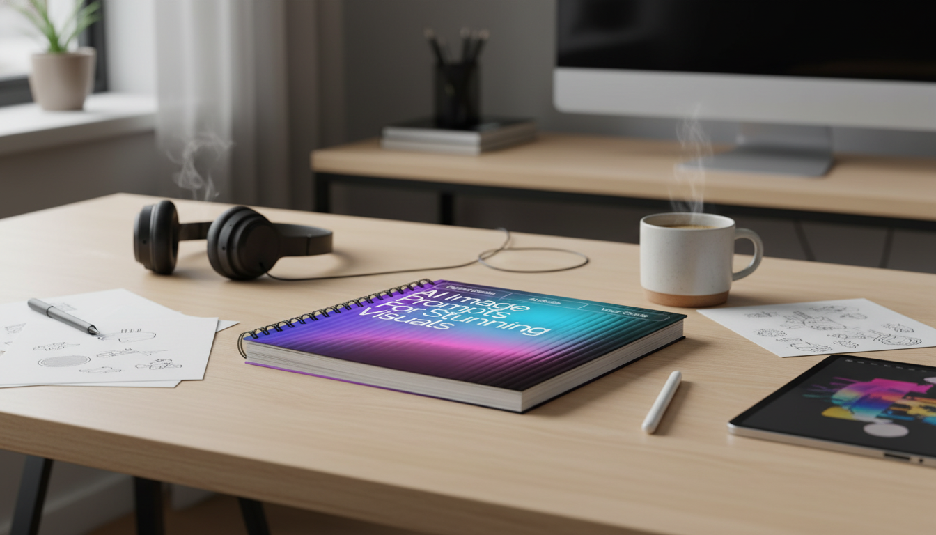
- AI Image Prompts for Stunning Visuals | Aesthetic Prompt Writing Guide for Creators, Designers & Digital Artists | ai prompts for aesthetic images ($11.99)
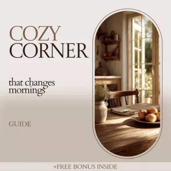
- The Cozy Corner That Changes Mornings: Ultimate Breakfast Nook with Banquette Seating Guide ($7.99)
For tooling details and constraints that can be supported by different generators, the official OpenAI image generation documentation is a reliable reference point.
FAQ
How long should a text-to-image recipe be?
A practical range is 1–3 sentences (roughly 40–120 words). Lead with must-haves (subject, palette, light, composition), then add optional finishing flavor at the end so it’s easy to trim or expand without changing the core look.
How can visuals stay consistent across a series?
Lock the palette, lighting direction/quality, lens or framing rules, and a single finish (like grain + matte contrast). Change only one variable per iteration—such as the subject or setting—while keeping everything else stable.
What details improve realism without overcomplicating?
Prioritize lighting direction and softness, a few named material textures, and one camera/optics cue (like 35mm or shallow depth of field). Add one finishing pass—subtle grain, matte blacks, or gentle bloom—to unify the image without piling on extra elements.


Leave a comment